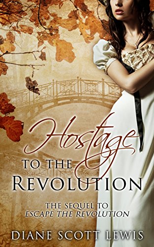
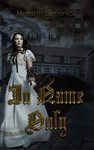
Who did it best? It would hardly be surprising if you went with the first one, "India Black and the Rajah's Ruby" because it's the only one of the bunch which is from a major publisher. However, I have to say that "Darkest Dreams" is just as well done, perhaps even better since the girl didn't get her head chopped off. "The Cry For Freedom" is also well done but I don't love the overlaid flag (Is it behind her, is it in front of her? Make up your mind!). But it looks like that house behind her is a part of the original stock image because it's also in "Culloden Spirit" so I guess the designer was trying to add something to make it unique. And talk about overlays, why is there a castle on her skirt?
Updated: Newly added "Boneseeker" is quite good too.
Updated: We have it in a new color on "The Lady of the Castle"! This one would have been my new favorite were it not for the trim at the bottom getting cut off.
Updated: And now it's in yellow too. Can't say I love it.
Update: She's finally in a different pose!


No comments:
Post a Comment